 |
 |
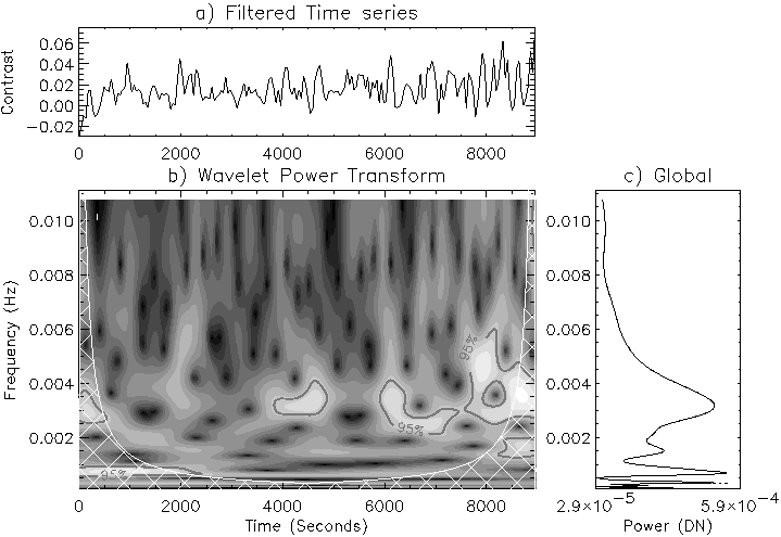
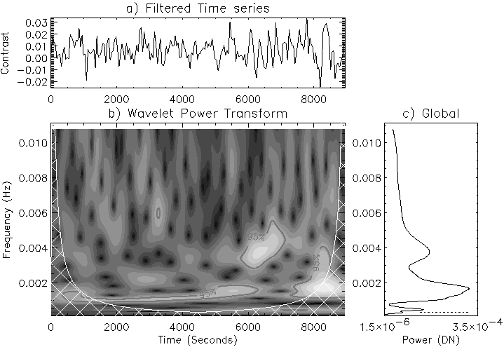
Example wavelet power transforms for NBP2 are shown in Figures 5.5 and 5.6, where the wavelet diagrams are divided into three boxes. The top panel (a) shows the filtered light curve, while the main panel (b) shows the wavelet power transform, with frequency as the vertical axis and time along the horizontal axis. This time axis is the same as in panel (a), so that direct comparisons between the occurrence of oscillatory power and the parent time series can be made. The lighter an area, the stronger the oscillatory power. The contours refer to the χ2-derived 95% confidence level, while the cross-hatched area is known as the Cone-Of-Influence (COI; Torrence & Compo 1998). Inside this hatched area, edge effects can be significant, so that any power appearing inside the hatched area has to be treated with caution. The right-hand panel (c) shows the global wavelet spectrum. This is the sum of power over all time as a function of frequency, analogous to the FFT. However it should be noted that at large wavelet scales (low frequency), peaks will be sharper and hence have a larger amplitude. So it is best to think of the global significance level as a good, but biased, estimate of the true Fourier power. The wavelet transforms clearly show the quasi-periodic nature of the oscillations in all wavelengths (agreeing with Test 5) where power at any frequency occurs in the form of wave-packets lasting for a few oscillations before disappearing. Its also clear that Ca II K3 exhibits power around 3-4 mHz, whereas Mg I b2 contains more power at lower frequencies (1.5-2 mHz)
 |
Tables 5.2 - 5.5 contain a summary of the behaviour of each NBP. The top part of each table refers to peaks in the FFT power spectrum (and is hereafter referred to as an FFT table). It contains a summary of the behaviour of the NBP in each wavelength as a function of thresholding intensity (as in Chapter 4). The `99' and `95' refer to the fact that the power at this frequency reached at least the 99% and 95% confidence levels, respectively. Wavelet diagrams were then used to look at the duration of wave-packets at each peak in the FFT. For a frequency to be considered, it must last for at least one full oscillation outside the COI at greater than 95% confidence. Any frequencies which showed more than two complete oscillation periods are presented in bold type. Together with the FFT confidence level, this gives an indication of the strength and significance of any oscillations. As in Chapter 4 the frequency resolution of 0.11 mHz is used as the error in the FFT values, and hence all values are grouped in &;177; 0.11 mHz blocks, with the first row in the table corresponding to the lower limit, and second row to the upper limit (e.g. the first data column contains any peaks at 1.00, 1.11, and 1.22 mHz)
 |
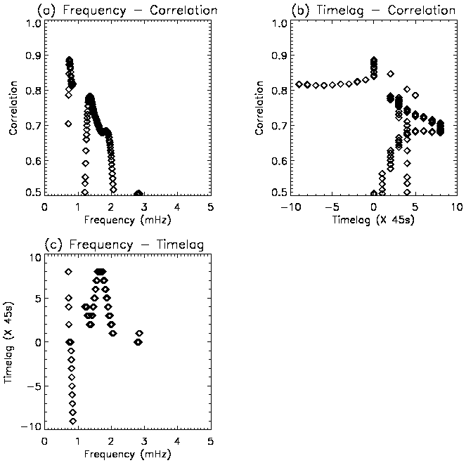
The bottom part of each table contains a summary of the possible travelling waves for each wavelength pair. Across every pair of wavelengths and for each frequency, the maximum correlation coefficient and corresponding timelag were recorded. Figure 5.7 shows the result of this procedure, and is now used to explain further steps. In Figure 5.7(a) there are two peaks above 1 mHz in the frequency-correlation curve: 1.3 mHz (correlation = 0.78) and 1.9 mHz (correlation = 0.68). By drawing horizontal lines from these peaks across into (b), the timelag-correlation curve, the corresponding timelags can be obtained. This can also be achieved by drawing vertical lines from these peaks, down into (c), the frequency-timelag curve. Maxima in the frequency-correlation curve were retained only if the correlation was above 0.6, and the corresponding timelag was less than 450 s (10 x 45 s cadence). By individual inspection of the power curves, it is clear that correlations of greater than 10 time units could not be attributed to individual wave packets. Any correlations below 1 mHz were also disregarded, as the high-pass filter (Figure 4.5) used dictates that there will be no wave-packets remaining below this frequency. Wavelet analysis and Fourier transforms were both featureless above 5 mHz, so this is taken as the upper limit to search for correlations. The range of values given in correlation and timelag in Tables 5.2 - 5.5 is determined by the maximum and minimum correlation and timelag in the frequency range of the chosen frequency &;177; 0.1 mHz. The final column denotes the speed of the wave. It is noted that a data cadence of 45 s, combined with the spread in height estimates (Table 5.1) leads to a large range of speed estimates. A `<' symbol signifies a maximum speed, whereas a `+' symbol signifies the speed may be faster than the quoted value. It should also be noted here that a negative timelag refers to a downward speed, whereas a zero timelag could suggest either evanescent waves or upward- or downward- propagating waves, within the available time resolution.
Some general comments can be made, before concentrating on each NBP individually. In the lower atmosphere (e.g., Mg I b1-0.4 Å), the oscillations are concentrated in the bright central portion of each NBP. However, in the upper chromospheric (e.g., Ca II K3), there is a greater tendency for some oscillatory power to exist in the outer regions (i.e., further from the centre of the NBP). This is best demonstrated by the moving threshold FFTs (Chapter 4, Figure 4.7), where the sudden appearance of power at a particular threshold indicates that it is confined in the central portion only. It can be explained in terms of the magnetic canopy effect, whereby the magnetic field lines diverge in the upper chromosphere. The FFT tables also show a tendency for higher frequency power (~3 mHz) to exist in the upper chromosphere, with lower frequencies (~2 mHz) more powerful in the lower chromosphere. This is in general agreement with Test 2. The following four subsections contain a qualitative description of the wave behaviour found in each NBP, especially pertaining to the the five tests stated in Section 5.1