General Guidelines
The current NMSU templates are based on Bootstrap 3 and generally follow Bootstrap HTML and CSS conventions, with some additions and modifications. The components and JavaScript plugins available in Bootstrap are also available. Developers developing sites for NMSU should become familiar with these conventions and components in order to better understand the foundations of NMSU's template. This feature sheet presents implementations for web development and design elements under NMSU's brand identity program.
Hero Image
The hero image is an optional design element that must follow the site navigation and appears just below the site navigation and above all other content. By design, it defaults to a minimum height of 25em (350px), but this may be overridden in a site or page CSS declaration. The general HTML markup would look like the following:
    <section id="hero" class="cover-bg">
        <div class="container">
            <div class="col-sm-10 col-sm-offset-1 text-center">
                <div class="page-header text-center">
                    <h1 class="shadowed">Hero Title Text (optional)</h1>
                </div>
                <p class="lead shadowed">
                    Hero lead text (optional)
                </p>
            </div>
        </div>
    </section>
There would also need to be a CSS declaration to declare the background image. This should go in the <head> in a <style> declaration, or in a page specific CSS file.
    #hero {
        background-image: url(path/to/your/image.jpg);
    }
Other Hero Configurations
Examples of other hero configurations are also available:
Affix Navigation (Right Side)
Bootstrap's Affix Navigation JavaScript module allows in-page navigation to scroll with the viewport on small, medium, and large viewports. The NMSU template uses a HTML ID of affix-side-nav for the Affix navigation element. An example of Affix navigation can be seen (on viewports wider than 768px) in the top right of the viewport for this page.
    <div class="container">
        <div class="row">
            <div class="col-sm-9">
                <section id="anchor1">
                    <h2>Title 1</h2>
                    ...
                </section>
                <section id="anchor2">
                    <h2>Title 2</h2>
                    ...
                    <div id="anchor2-1">
                        <h3>Title 2 – Subsection 1</h3>
                        ...
                    </div>
                    <div id="anchor2-2">
                        <h3>Title 2 – Subsection 2</h3>
                        ...
                    </div>
                </section>
                <section id="anchor3">
                    <h2>Title 3</h2>
                    ...
                </section>
            </div>
            <nav id="affix-side-nav" class="col-sm-3 hidden-xs">
                <ul class="nav small" id="affix-side-ul">
                    <li class="active"><a href="#anchor1">Title 1</a></li>
                    <li><a href="#anchor2">Title 2</a>
                        <ul class="nav">
                            <li><a href="#anchor2-1">Title 2 - Subsection 1</a></li>
                            <li><a href="#anchor2-2">Title 2 - Subsection 2</a></li>
                        </ul>
                    </li>
                    <li class="active"><a href="#anchor3">Title 3</a></li>
                </ul>
            </nav>
        </div>
    </div>
Affix Scroll Limits
To limit the area that the Affix navigation will scroll with the page, you may declare an offset top and/or an offset bottom. The offset top is
the number of pixels from the top of the <body> to the top limit of the Affix navigation. The offset bottom is the number of
pixels from the bottom limit of the Affix navigation to the bottom of the <body>.
These offsets can be declared in HTML on the top-most <ul> in the #affix-side-nav container using data attributes.
The example given above would be modified as follows to contain the Affix navigation to a portion of the body 560px from the top of the page and 2970px
from the bottom.
    <nav id="affix-side-nav" class="col-sm-3 hidden-xs">
        <ul class="nav small" id="affix-side-ul" data-spy="affix"
                data-offset-top="560" data-offset-bottom="50">
            ...
         </ul>
    </nav>
This can also be achieved via JavaScript. Instead of declaring the data elements, you could add the following JavaScript to the bottom of the <body>
or in a page-specific JS include.
    $('#affix-side-ul').affix({         // initiate Affix on this element
        offset: {                       // declare offset as an object
            top: 560,                   // offset.top attribute (data-offset-top)
            bottom: 50                  // offset.bottom attribute (data-offset-bottom)
        }
    });
Declaring the Affix offset attribute via JavaScript allows much greater customization by allowing a function to declared as the offset rather than a fixed value. This can be very useful for accommodating responsive elements, elements with dynamic heights, elements that may be hidden, etc.
    var offset_top = function() {
        // calculate offset from top of body as offset_top
        return offset_top;
    }
    $('#affix-side-ul').affix({         // initiate Affix on this element
        offset: {                       // declare offset as an object
            top: offset_top,            // offset.top attribute references offset_top function
        }
    });
The solution used on this page combines the getPosition.min.js library (must be included explicitly) with jQuery's getOuterheight() function to
calculate the top and bottom of the parent container. By calculating these values in a function and sending those function calls as the offset_top and offset_bottom
to Affix, we are able to set a dynamic containing element for the Affix navigation.
    var offset_top = function () {
        var content_top = getOffsetRect(document.getElementById("side-affix-intro")).top;
        return content_top;
    };
    var offset_bottom = function () {
        var content_top = getOffsetRect(document.getElementById("side-affix-intro")).top;
        var section_height = $("#side-affix-intro").outerHeight();
        var content_bottom = $("body").outerHeight() - (content_top + section_height);
        return content_bottom;
    }
    $("#affix-side-ul").affix({
        offset: {
            top: offset_top,
            bottom: offset_bottom
        }
    });
Affix and Scrollspy
In order to have Affix scroll only from the top of its container to the bottom of its container, you must specify offset from the top of the page and an offset from the bottom of the page. These can be specified
Affix can also highlight the current section the reader is in using the Scrollspy module.
Scrollspy can be activated in HTML by specifying the element data-spy="scroll" and data-target="#affix-side-nav" in the container being spied on.
If you would like to add additional padding from the top of the viewport (e.g., in the case of a fixed position element at the top of the viewport), add a data-offset element.
For example, to add an extra 15 pixels above the Affix navigation, one would use data-offset="15".
Scrollspy can also be activated via JavaScript. The example above (Scrollspy on the <body> tag targeting #affix-side-nav with a 15px offset) would use
    $('body').scrollspy({               // the element being scrolled
        target: '#affix-side-nav',      // the element being updated by scroll
        offset: 15                      // additional offset from the top, in pixels
    });
Please note: although not explicitly stated in the Scrollspy documentation, the element being scrolled must have a scroll bar to function properly.
This can be achieved by just using the <body> element, or by assigning a fixed height and overflow-y: scroll; CSS rule.
Affix Navigation (Top)
Another configuration for Affix as a fixed top navigation menu is also available.
Parallax Backgrounds
Parallax backgrounds use a fixed background image to allow page content to scroll past and give the illusion of motion parallax on the page.
To create a parallax background, use the .cover-bg class, which makes the background fill the viewport, and add the .parallax class. You will also need
to set the path to the background image somewhere. Best practices state that this declaration should be made in the <head> or in a stylesheet, but you
can also set it inline using the style attribute.
    <div class="cover-bg parallax" style="path/to/background">
        ...
    </p>
Images in Parallax Backgrounds
Parallax backgrounds expand to fill the entire viewport (both in width and height), and not just the element with the .parallax class. This element will provide a window to the background. Be sure you understand how the background image will look in several viewport sizes to avoid backgrounds that would look great in a static context, yet become distorted in a parallax context. In the example below, the background image is too short for most view ports, so it is stretched and the building name is not visible.
Please note: parallax backgrounds are not currently supported on iOS devices.
Carousel
Bootstrap's Carousel JavaScript plug-in provides a standard solution for creating slide shows. Carousel control can be done through Indicators and/or Controls inside the Carousel, or using external links/controls. When the Carousel has focus, it may also be controlled using the left and right arrows on a keyboard. Carousels also have styled captions. An example of image captions for Carousel is given in Slide 2 of the slide show below.


<div class="text-center padded-15">
<div class="carousel slide inline-block" id="historic-slider" data-ride="carousel">
<!-- Indicators -->
<ol class="carousel-indicators">
<li data-target="#historic-slider" data-slide-to="0" class="active"></li>
<li data-target="#historic-slider" data-slide-to="1"></li>
<li data-target="#historic-slider" data-slide-to="2"></li>
<li data-target="#historic-slider" data-slide-to="3"></li>
</ol>
<!-- Slides -->
<div class="carousel-inner">
<div class="item active"><img src="images/carousel/goddard_gates_cw.png" alt="Goddard Hall as seen through the old gates of Miller field."/></div>
<div class="item">
<img src="images/carousel/historical_chem_02_cw.png" alt="Historical photo of NMSU Chemistry Students in lab."/>
<div class="carousel-caption">
<h3>Carousel Caption</h3>
<p>Historical photo of NMSU Chemistry Students in lab.</p>
</div>
</div>
<div class="item">
<!-- The intent of Holder.js is to create placeholders for images while content loads, preventing document reflow. Here we have used it to generate content as a demonstration
of how styled, non-media content can be introduced into a Carousel. HTML5 <img> elements need a src attribute to validate, but this is injected after the DOM loads.
It also may not render properly in some older browsers, such as IE7. Check your support requirements before choosing a solution for your page. -->
<img alt="Placeholder provided by holder.js to demonstrate styled images as slides" data-src="holder.js/750x450/auto/#882345:#fff/text:Styled text via an image slide created with Holder.js" data-holder-rendered="true"/>
<div class="carousel-caption">
<a class="btn btn-default" target="_blank" href="https://github.com/imsky/holder">Learn about Holder.js</a>
</div>
</div>
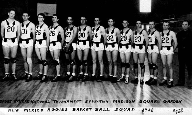
<div class="item"><img src="images/carousel/1939_team_photo_cw.png" alt="Aggie Basketball Squad in 1938" /></div>
</div>
<!-- Controls -->
<a class="left carousel-control" href="#historic-slider" role="button" data-slide="prev">
<span class="glyphicon glyphicon-chevron-left" aria-hidden="true"></span>
<span class="sr-only">Previous</span>
</a>
<a class="right carousel-control" href="#historic-slider" role="button" data-slide="next">
<span class="glyphicon glyphicon-chevron-right" aria-hidden="true"></span>
<span class="sr-only">Next</span>
</a>
</div>
</div>
Activation and Customization
The slide show above is activated via HTML using the data-ride="carousel" attribute. Carousel can also be activated via JavaScript using the .carousel()
method (e.g., $(".carousel").carousel();). The carousel will start with the .item with class .active showing. The default slide show changes
slides every 5 seconds, pauses when a user pointer is hovering over it, and wraps back to the first slide after the last slide.
Please note: Exactly one .item in the Carousel must have the .active class for the Carousel to function.
Each of these behaviors can be modified either through HTML using data attributes or through JavaScript when activating the Carousel. In HTML, to change how often the slides
transition, declare a data-interval attribute equal to the desired number of milliseconds. To change prevent the slideshow from pausing during mouseover, declare
data-pause="false" on the Carousel entity. To prevent the slideshow from repeating, declare data-wrap="false". To create a Carousel that plays once
from start to finish, does not pause on hover, and switches slides once every 2.5 seconds, the code would look like:
    <div class="carousel slide" id="example-slider" data-ride="carousel" data-interval="2500" data-wrap="false" data-pause="false" >
        ...
    </div>
The same configuration could be achieved via JavaScript. As a note, it is best not to mix and match JavaScript with data attributes. Do all of your activation and configuration for each Carousel using one or the other.
    $("#example-slider").carousel({
        interval: 2500,
        wrap: false,
        pause: false
    });
Adding Swipe Functions to Carousel
If you would like to enable touch features for Carousel (or other components in general), the easiest way is to use jQuery Mobile's touch libraries. A minified version of the touch library (without any other jQuery Mobile features) is available in the default assets/js/ folder in the development templates. The code below gives an example of activating swipe behaviors to manipulate the Carousel.
    $("#historic-slider").swiperight(function() {
        $(this).carousel('prev');
    });
    $("#historic-slider").swipeleft(function() {
        $(this).carousel('next');
    });
Collapse
Collapsible elements are possible using Bootstrap's Collapse JavaScript plug-in. Collapse is an easy way to toggle the visibility of content using an external link or button.
As a link
How much wood could a woodchuck chuck if a woodchuck could chuck wood?
About as much wood as a woodchuck would chuck if a woodchuck could chuck wood.
    <div class="panel panel-default">
        <div class="panel-heading">As a link</div>
        <div class="panel-body">
            <p>How much wood could a woodchuck chuck if a woodchuck could chuck wood?</p>
            <a href="#collapseLink" data-toggle="collapse">How much?</a>
        </div>
        <div class="collapse padded-15" id="collapseLink">
            <p class="alert alert-info">About as much wood as a woodchuck would chuck if a woodchuck could chuck wood.</p>
        </div>
    </div>
As a button
How many possible configurations are there for the order of cards in a deck of standard playing cards?
80,658,175,170,943,878,571,660,636,856,403,766,975,289,505,440,883,277,824,000,000,000,000
    <div class="panel panel-default">
        <div class="panel-heading">As a button</div>
        <div class="panel-body">
            <p>How many possible configurations are there for the order of cards in a deck of standard playing cards?</p>
            <a href="#collapseButton" data-toggle="collapse">Show me</a>
        </div>
        <div class="collapse padded-15" id="collapseButton">
            <p class="alert alert-info">80,658,175,170,943,878,571,660,636,856,403,766,975,289,505,440,883,277,824,000,000,000,000</p>
        </div>
    </div>
Accordions
The Collapsible plug-in can also be used to create accordion-style interfaces. Simply add collapsible behaviors to the Panel Group element
by hiding the .panel-body elements with .collapse and toggling them with the .panel-headers. To make a .collapse open by default, give it an
additional .in class. Also, make sure if you are using aria accessibility attributes that an element with .collapse and .in classes will have
aria-expanded="true".
- Collapsible ListGroup Item One
- Collapsible ListGroup Item Two
- Collapsible ListGroup Item Three
    <div class="panel-group" id="accordion" role="tablist" aria-multiselctable="true">
        <div class="panel panel-primary">
            <div class="panel-heading" role="tab" id="headingOne">
                <h4 class="panel-title">
                    <a data-toggle="collapse" data-parent="#accordion" href="#collapseOne" aria-expanded="true" aria-controls="collapseOne">
                        Collapsible Group Item #1
                    </a>
                </h4>
            </div>
            <div id="collapseOne" class="panel-collapse collapse in" role="tabpanel" aria-labelledby="headingOne">
                <div class="panel-body">
                   Collapsible Body #1
                </div>
            </div>
        </div>
        <div class="panel panel-primary">
            <div class="panel-heading" role="tab" id="headingTwo">
                <h4 class="panel-title">
                    <a class="collapsed" data-toggle="collapse" data-parent="#accordion" href="#collapseTwo" aria-expanded="false" aria-controls="collapseTwo">
                        Collapsible Group Item #2
                    </a>
                </h4>
            </div>
            <div id="collapseTwo" class="panel-collapse collapse" role="tabpanel" aria-labelledby="headingTwo">
                <div class="panel-body">
                    Collapsible Body #2
                </div>
            </div>
        </div>
        <div class="panel panel-primary">
            <div class="panel-heading" role="tab" id="headingThree">
                <h4 class="panel-title">
                    <a class="collapsed" data-toggle="collapse" data-parent="#accordion" href="#collapseThree" aria-expanded="false" aria-controls="collapseThree">
                        Collapsible Group ListGroup
                    </a>
                </h4>
            </div>
            <div id="collapseThree" class="panel-collapse collapse" role="tabpanel" aria-labelledby="headingThree">
                <ul class="list-group">
                    <li class="list-group-item">Collapsible ListGroup Item One</li>
                    <li class="list-group-item">Collapsible ListGroup Item Two</li>
                    <li class="list-group-item">Collapsible ListGroup Item Three</li>
                </ul>
            </div>
        </div>
    </div>
Tabs
Tabbed interfaces are available using the Bootstrap Tab JavaScript plug-in. The default styling is light and allows for dropdown tab navigation if necessary.
Lorem ipsum dolor sit amet, consectetur adipiscing elit. Pellentesque facilisis eros vulputate, lobortis lectus id, mollis ipsum. Fusce viverra neque nec lacus mollis, ut elementum magna pellentesque. Fusce quis eros sagittis, dictum felis id, lacinia arcu. Vestibulum maximus tortor sed blandit pulvinar. Phasellus vehicula porta justo, eu aliquet dui. Fusce dignissim urna ac nibh luctus, ut volutpat arcu fermentum. Morbi vel enim at elit euismod pellentesque et vel nunc. Phasellus quis fermentum justo. Etiam sodales augue et finibus ultricies.
Nulla ac consequat libero, sed dapibus erat. Nam nec lectus quis nulla bibendum hendrerit. Nunc elementum blandit tortor ac commodo. Quisque in vulputate lorem. Phasellus ut facilisis magna, vitae bibendum sapien. Vestibulum imperdiet a ipsum quis volutpat. Nam blandit pulvinar nisl, a sollicitudin turpis suscipit ac. In hac habitasse platea dictumst. Nullam maximus vulputate tortor nec vulputate. Aenean sed venenatis nisi. Nullam blandit porttitor enim, ac tristique tortor consectetur eu. Aenean ligula velit, pretium vehicula facilisis ac, tempus ut felis. In mollis eros in facilisis pretium. In felis enim, fermentum ac dignissim non, consectetur at tortor.
Vivamus quis mauris gravida, egestas diam non, commodo ipsum. Nunc mi tellus, euismod sed ornare quis, vulputate quis lectus. Mauris ut vestibulum leo. Quisque dignissim augue semper lectus lobortis, eget accumsan urna porttitor. Nullam vitae ultricies orci. Suspendisse at quam velit. Vivamus consequat fringilla semper. Duis vulputate, lorem a cursus pharetra, risus nibh consequat risus, non laoreet ante erat quis est. Fusce turpis urna, laoreet eu justo non, eleifend iaculis nisl. Vestibulum ante ipsum primis in faucibus orci luctus et ultrices posuere cubilia Curae; Curabitur ac ligula ultrices, suscipit nisi sed, ultrices elit. Nullam facilisis neque felis. Donec nec malesuada leo, in aliquam urna.
Donec magna dui, venenatis at sem id, pharetra finibus odio. Phasellus ultrices tortor quis quam molestie egestas eget id odio. Morbi vehicula dui vitae arcu maximus, id ullamcorper ante auctor. Nam vel fermentum nibh. Mauris commodo quam sit amet pharetra rhoncus. Quisque eleifend ex a lacus suscipit dictum. Fusce nec mattis ligula. Integer varius lectus arcu, ut consequat eros gravida nec.
    <div id="tab-example">
        <ul class="nav nav-tabs" role="tablist">
            <li role="presentation" class="active">
                <a href="#tab-example-1" aria-controls="tab-example-1" role="tab" data-toggle="tab">Tab 1</a>
            </li>
            <li role="presentation">
                <a href="#tab-example-2" aria-controls="tab-example-2" role="tab" data-toggle="tab">Tab 2</a>
            </li>
            <li class="dropdown" role="presentation">
                <a aria-expanded="false" href="#" id="tab-drop" class="dropdown-toggle" data-toggle="dropdown" aria-controls="tab-drop-nav">
                    Dropdown <span class="caret"></span>
                </a>
                <ul class="dropdown-menu" role="menu" aria-labelledby="tab-drop" id="tab-drop-nav">
                    <li role="presentation">
                        <a href="#tab-example-3" aria-controls="tab-example-3" role="tab" data-toggle="tab">Tab 3</a>
                    </li>
                    <li role="presentation">
                        <a href="#tab-example-4" aria-controls="tab-example-4" role="tab" data-toggle="tab">Tab 4</a>
                    </li>
                </ul>
            </li>
        </ul>
        <div class="tab-content padded-15">
            <div role="tabpanel" class="tab-pane fade in active" id="tab-example-1">
                <p>Lorem ipsum dolor sit amet, consectetur adipiscing elit. Pellentesque facilisis eros vulputate, lobortis lectus id, mollis ipsum. Fusce viverra neque nec lacus mollis, ut elementum magna pellentesque. Fusce quis eros sagittis, dictum felis id, lacinia arcu. Vestibulum maximus tortor sed blandit pulvinar. Phasellus vehicula porta justo, eu aliquet dui. Fusce dignissim urna ac nibh luctus, ut volutpat arcu fermentum. Morbi vel enim at elit euismod pellentesque et vel nunc. Phasellus quis fermentum justo. Etiam sodales augue et finibus ultricies.</p>
            </div>
            <div role="tabpanel" class="tab-pane fade" id="tab-example-2">
                <p>Nulla ac consequat libero, sed dapibus erat. Nam nec lectus quis nulla bibendum hendrerit. Nunc elementum blandit tortor ac commodo. Quisque in vulputate lorem. Phasellus ut facilisis magna, vitae bibendum sapien. Vestibulum imperdiet a ipsum quis volutpat. Nam blandit pulvinar nisl, a sollicitudin turpis suscipit ac. In hac habitasse platea dictumst. Nullam maximus vulputate tortor nec vulputate. Aenean sed venenatis nisi. Nullam blandit porttitor enim, ac tristique tortor consectetur eu. Aenean ligula velit, pretium vehicula facilisis ac, tempus ut felis. In mollis eros in facilisis pretium. In felis enim, fermentum ac dignissim non, consectetur at tortor.</p>
            </div>
            <div role="tabpanel" class="tab-pane fade" id="tab-example-3">
                <p>Vivamus quis mauris gravida, egestas diam non, commodo ipsum. Nunc mi tellus, euismod sed ornare quis, vulputate quis lectus. Mauris ut vestibulum leo. Quisque dignissim augue semper lectus lobortis, eget accumsan urna porttitor. Nullam vitae ultricies orci. Suspendisse at quam velit. Vivamus consequat fringilla semper. Duis vulputate, lorem a cursus pharetra, risus nibh consequat risus, non laoreet ante erat quis est. Fusce turpis urna, laoreet eu justo non, eleifend iaculis nisl. Vestibulum ante ipsum primis in faucibus orci luctus et ultrices posuere cubilia Curae; Curabitur ac ligula ultrices, suscipit nisi sed, ultrices elit. Nullam facilisis neque felis. Donec nec malesuada leo, in aliquam urna.</p>
            </div>
            <div role="tabpanel" class="tab-pane fade" id="tab-example-4">
                <p>Donec magna dui, venenatis at sem id, pharetra finibus odio. Phasellus ultrices tortor quis quam molestie egestas eget id odio. Morbi vehicula dui vitae arcu maximus, id ullamcorper ante auctor. Nam vel fermentum nibh. Mauris commodo quam sit amet pharetra rhoncus. Quisque eleifend ex a lacus suscipit dictum. Fusce nec mattis ligula. Integer varius lectus arcu, ut consequat eros gravida nec.</p>
            </div>
        </div>
    </div>
Pill Tabs
Tabs can also be given "pill" styling by replacing the .nav-tabs class on the parent <ul> with .nav-pills.
Lorem ipsum dolor sit amet, consectetur adipiscing elit. Pellentesque facilisis eros vulputate, lobortis lectus id, mollis ipsum. Fusce viverra neque nec lacus mollis, ut elementum magna pellentesque. Fusce quis eros sagittis, dictum felis id, lacinia arcu. Vestibulum maximus tortor sed blandit pulvinar. Phasellus vehicula porta justo, eu aliquet dui. Fusce dignissim urna ac nibh luctus, ut volutpat arcu fermentum. Morbi vel enim at elit euismod pellentesque et vel nunc. Phasellus quis fermentum justo. Etiam sodales augue et finibus ultricies.
Nulla ac consequat libero, sed dapibus erat. Nam nec lectus quis nulla bibendum hendrerit. Nunc elementum blandit tortor ac commodo. Quisque in vulputate lorem. Phasellus ut facilisis magna, vitae bibendum sapien. Vestibulum imperdiet a ipsum quis volutpat. Nam blandit pulvinar nisl, a sollicitudin turpis suscipit ac. In hac habitasse platea dictumst. Nullam maximus vulputate tortor nec vulputate. Aenean sed venenatis nisi. Nullam blandit porttitor enim, ac tristique tortor consectetur eu. Aenean ligula velit, pretium vehicula facilisis ac, tempus ut felis. In mollis eros in facilisis pretium. In felis enim, fermentum ac dignissim non, consectetur at tortor.
Vivamus quis mauris gravida, egestas diam non, commodo ipsum. Nunc mi tellus, euismod sed ornare quis, vulputate quis lectus. Mauris ut vestibulum leo. Quisque dignissim augue semper lectus lobortis, eget accumsan urna porttitor. Nullam vitae ultricies orci. Suspendisse at quam velit. Vivamus consequat fringilla semper. Duis vulputate, lorem a cursus pharetra, risus nibh consequat risus, non laoreet ante erat quis est. Fusce turpis urna, laoreet eu justo non, eleifend iaculis nisl. Vestibulum ante ipsum primis in faucibus orci luctus et ultrices posuere cubilia Curae; Curabitur ac ligula ultrices, suscipit nisi sed, ultrices elit. Nullam facilisis neque felis. Donec nec malesuada leo, in aliquam urna.
Donec magna dui, venenatis at sem id, pharetra finibus odio. Phasellus ultrices tortor quis quam molestie egestas eget id odio. Morbi vehicula dui vitae arcu maximus, id ullamcorper ante auctor. Nam vel fermentum nibh. Mauris commodo quam sit amet pharetra rhoncus. Quisque eleifend ex a lacus suscipit dictum. Fusce nec mattis ligula. Integer varius lectus arcu, ut consequat eros gravida nec.
Text
Lorem ipsum dolor sit amet, consectetur adipiscing elit. Etiam faucibus luctus eros, vel tempor ipsum tincidunt sollicitudin. Aliquam sit amet ultrices ligula. Maecenas pretium odio nec ullamcorper posuere. Quisque tristique turpis in venenatis rutrum. Praesent nunc neque, posuere sit amet arcu at, aliquet ornare dui. Lorem ipsum dolor sit amet, consectetur adipiscing elit. Nunc ultrices nisi vel euismod elementum. Cras id diam nisi. Integer accumsan sit amet turpis vitae molestie. In magna urna, vestibulum vel imperdiet et, ultrices vel urna. Nulla dui dolor, blandit ut pulvinar nec, aliquet in velit. Donec faucibus diam ornare, auctor mi eget, molestie orci. Duis a risus scelerisque, luctus metus non, consequat metus.
Headings
H1 Heading Example Subheading
H2 Heading Example Subheading
H3 Heading Example Subheading
H4 Heading Example Subheading
H5 Heading Example Subheading
H6 Heading Example Subheading
    <h1>H1 Heading Example <small>Subheading</small></h1>
    <h2>H2 Heading Example <small>Subheading</small></h2>
    <h3>H3 Heading Example <small>Subheading</small></h3>
    <h4>H4 Heading Example <small>Subheading</small></h4>
    <h5>H5 Heading Example <small>Subheading</small></h5>
    <h6>H6 Heading Example <small>Subheading</small></h6>
Lead Text
The .lead class can be added to the container of text to give the text more weight and bring more attention to it. Lorem ipsum dolor sit amet, consectetur adipiscing elit. Etiam faucibus luctus eros, vel tempor ipsum tincidunt sollicitudin. Aliquam sit amet ultrices ligula. Maecenas pretium odio nec ullamcorper posuere.
Blockquotes
Lorem ipsum dolor sit amet, consectetur adipiscing elit. Etiam faucibus luctus eros, vel tempor ipsum tincidunt sollicitudin. Aliquam sit amet ultrices ligula. Maecenas pretium odio nec ullamcorper posuere. Quisque tristique turpis in venenatis rutrum.
    <blockquote>
        <p>Lorem ipsum dolor sit amet, consectetur adipiscing elit...</p>
        <footer>Place your <cite title="Example">Citation Here</cite></footer>
    </blockquote>
Reverse Blockquotes
You can easily create a right-justified blockquote by adding the .blockquote-reverse class to any
<blockquote>element.
    <blockquote class="blockquote-reverse">
        ...
    </blockquote>
Hanging Indents
Simply add the class .hanging-indent to an element to format that element using a hanging indentation. Lorem ipsum dolor sit amet, consectetur adipiscing elit. Morbi gravida cursus massa et convallis. Vivamus non quam nec urna maximus eleifend. Mauris non sapien ac erat vehicula luctus. Etiam faucibus ligula eu eros varius, nec finibus lacus feugiat. Nunc quis sem suscipit, consectetur ex sed, scelerisque lectus.
Text Alignment
Text can be left aligned in an element by declaring the .text-left class on that element. Lorem ipsum dolor sit amet, consectetur adipiscing elit. Etiam faucibus luctus eros, vel tempor ipsum.
Text can be right aligned in an element by declaring the .text-right class on that element. Lorem ipsum dolor sit amet, consectetur adipiscing elit. Etiam faucibus luctus eros, vel tempor ipsum.
Text can be centered in an element by declaring the .text-center class on that element. Lorem ipsum dolor sit amet, consectetur adipiscing elit. Etiam faucibus luctus eros, vel tempor ipsum.
Text can be justified in an element by declaring the .text-justify class on that element. Lorem ipsum dolor sit amet, consectetur adipiscing elit. Etiam faucibus luctus eros, vel tempor ipsum.
Turn line-wrap off with .text-nowrap.
Text Color
Text can be given contextual color by assigning a class to the parent element. For the primary brand color, use .text-primary.
Text can be given contextual color by assigning a class to the parent element. For a muted gray color, use .text-muted.
Text can be given contextual color by assigning a class to the parent element. For the green color used by success alerts, use .text-success.
Text can be given contextual color by assigning a class to the parent element. For the blue color used by information alerts, use .text-info.
Text can be given contextual color by assigning a class to the parent element. For the orange color used by warning alerts, use .text-warning.
Text can be given contextual color by assigning a class to the parent element. For the red color used by error alerts, use .text-danger.
Text Backgrounds
When using the background color classes below, it is a good idea to use an element with padding or add an additional class or CSS rule to provide padding.
Text can be given contextual background color by assigning a class to the parent element. For the primary brand color, use .bg-primary.
Text can be given contextual background color by assigning a class to the parent element. For the green color used by success alerts, use .bg-success.
Text can be given contextual background color by assigning a class to the parent element. For the blue color used by information alerts, use .bg-info.
Text can be given contextual background color by assigning a class to the parent element. For the orange color used by warning alerts, use .bg-warning.
Text can be given contextual background color by assigning a class to the parent element. For the red color used by error alerts, use .bg-danger.
Alert Messages
Alert messages with predefined background and text colors, as well as some additional styling are also available. Alert elements must have the .alert class declared and a class to define the alert type. Icons may be added using Bootstrap glyphicons, and alerts may even be made dismissible by declaring the .alert-dismissible class and adding a close button as seen in the example below.
Hey! This is a success alert.
Hey! This is an information alert.
Hey! This is a warning alert.
Hey! This is a danger alert.
Hey! This is a dismissible information alert with an icon.
    <p class="alert alert-success"><strong>Hey!</strong> This is a success alert.</p>
    <p class="alert alert-info"><strong>Hey!</strong> This is an information alert.</p>
    <p class="alert alert-warning"><strong>Hey!</strong> This is a warning alert.</p>
    <p class="alert alert-danger"><strong>Hey!</strong> This is a danger alert.</p>
    <p class="alert alert-info alert-dismissible">
        <button type="button" class="close" data-dismiss="alert" aria-label="Close"><span aria-hidden="true">×</span></button>
        <span class="glyphicon glyphicon-info-sign"></span>
        <strong>Hey!</strong> This is a dismissible information alert with an icon.
    </p>
Media Tease
When displaying a piece of media and block of descriptive text, the media tease component is a simple way to quickly and uniformly style content.
Example Media Collection

Media heading
Descriptive media text. Lorem ipsum dolor sit amet, consectetur adipiscing elit. Vivamus mollis, tortor quis semper lacinia, tellus augue ultricies felis, ut viverra est neque in massa.Media heading
Descriptive media text. Nullam a orci ac nisi pulvinar vestibulum. Nam ut accumsan mauris. Sed mauris tortor, luctus vitae mauris eget, scelerisque adipiscing est. Fusce posuere convallis nulla, et laoreet nibh scelerisque non. Interdum et malesuada fames ac ante ipsum primis in faucibus. In ac nisl eu dolor ultricies interdum. Proin quis nisl magna. Ut metus tellus, ullamcorper non nulla quis, sodales consequat diam.

Media heading
Descriptive media text. Nunc vel leo dolor. Praesent suscipit porttitor tortor at euismod. Vivamus tempor molestie volutpat. Proin ac quam tempor lacus tristique vulputate sed ac erat. Vivamus ultrices dolor nulla, sed pellentesque lacus egestas sit amet. Phasellus luctus iaculis tortor vel scelerisque.
Nested media heading
Descriptive media text. Donec ut est fringilla, eleifend lectus id, gravida ante. Nullam consequat sed quam vitae sagittis. Suspendisse cursus vestibulum odio id euismod. Pellentesque eu odio a sapien eleifend interdum sed sit amet eros. In eu velit ultrices, consectetur sem rhoncus, malesuada lectus.
    <div class="media">
        <div class="media-left">
            <a href="#">
                <img class="media-object" src="path/to/media" alt="64x64 Holder">
            </a>
        </div>
        <div class="media-body">
            <h4 class="media-heading">Media heading</h4>
            Descriptive media text...
        </div>
    </div>
    <div class="media">
        <div class="media-body">
            <h4 class="media-heading">Media heading</h4>
            Descriptive media text...
        </div>
        <div class="media-right">
            <a href="#">
                <img class="media-object" src="path/to/media" alt="64x128 Holder">
            </a>
        </div>
    </div>
    <div class="media">
        <div class="media-left">
            <a href="#">
                <img class="media-object" src="path/to/media" alt="128x64 Holder">
            </a>
        </div>
        <div class="media-body">
            <h4 class="media-heading">Media heading</h4>
            Descriptive media text...
            <div class="media">
                <div class="media-left">
                    <a href="#">
                        <img class="media-object" src="path/to/media" alt="64x64 Holder">
                    </a>
                </div>
                <div class="media-body">
                    <h4 class="media-heading">Nested media heading</h4>
                    Descriptive media text...
                </div>
            </div>
        </div>
    </div>
Figures
Images and figures can be given the flat Bootstrap style easily using the Thumbnail component. Figures can also be given the classic NMSU styling with drop shadow by adding the .figure-bordered class. You should also add the .img-responsive class to any figure image to make sure it resizes according to its parent. Other classes are also available to help align images or give small aesthetic tweaks to images or captions. Some example images are shown below with their corresponding markup.

    <div class="row">
        <div class="col-sm-3">
            <figure class="thumbnail">
                <img class="img-responsive" data-src="holder.js/256x256/auto/#882345:#fff" alt="256x256 Holder" />
                <figcaption class="caption">This is a standard Bootstrap example figure with caption.</figcaption>
            </figure>
        </div>
    </div>
Inline Figure in Text Block, Aligned Right

Lorem ipsum dolor sit amet, consectetur adipiscing elit, sed do eiusmod tempor incididunt ut labore et dolore magna aliqua. Ut enim ad minim veniam, quis nostrud exercitation ullamco laboris nisi ut aliquip ex ea commodo consequat. Duis aute irure dolor in reprehenderit in voluptate velit esse cillum dolore eu fugiat nulla pariatur. Excepteur sint occaecat cupidatat non proident, sunt in culpa qui officia deserunt mollit anim id est laborum.
    <figure class="figure-bordered figure-inline pull-right">
        <img class="img-responsive" data-src="holder.js/128x128/auto/#882345:#fff" alt="128x128 Right Align" />
    </figure>
    <p>...</p>
Inline Figure in Text Block, Captioned, Aligned Left
Lorem ipsum dolor sit amet, consectetur adipiscing elit, sed do eiusmod tempor incididunt ut labore et dolore magna aliqua. Ut enim ad minim veniam, quis nostrud exercitation ullamco laboris nisi ut aliquip ex ea commodo consequat. Duis aute irure dolor in reprehenderit in voluptate velit esse cillum dolore eu fugiat nulla pariatur. Excepteur sint occaecat cupidatat non proident, sunt in culpa qui officia deserunt mollit anim id est laborum.
    <figure class="figure-bordered figure-inline pull-left">
        <img class="img-responsive" data-src="holder.js/128x128/auto/#882345:#fff" alt="128x128 Left Align" />
    </figure>
    <p>...</p>
Align Center

    <h4>Align Center</h4>
    <div class="row">
        <div class="col-sm-4 col-sm-offset-4">
            <figure class="centered full-width inline-block figure-bordered">
                <img data-src="holder.js/256x256/auto/#EAAB0D:#000" alt="256x256 Yellow Center Align" />
                <figcaption class="text-center">Example caption on centered NMSU figure.</figcaption>
            </figure>
        </div>
    </div>
Rounded Corners on Image

    <h4>Rounded Corners on Image</h4>
    <div class="row">
        <div class="col-sm-3">
            <figure class="figure-bordered centered">
                <img class="img-rounded img-responsive" data-src="holder.js/256x256/auto/#00693C:#fff" alt="256x256 Green Rounded" />
            </figure>
        </div>
    </div>
Set of Thumbnails

Styled Title
Captions can have more styling if desired using standard markup.
    <div class="row">
        <div class="col-md-3 col-xs-6">
            <figure class="thumbnail">
                <img class="img-responsive" data-src="holder.js/200x200/auto/#80379B:#fff" alt="200x200 Purple Thumb 1" />
            </figure>
        </div>
        <div class="col-md-3 col-xs-6">
            <figure class="thumbnail">
                <img class="img-responsive" data-src="holder.js/200x200/auto/#80379B:#fff" alt="200x200 Purple Thumb 2" />
                <div class="caption">Thumbnail with caption</div>
            </figure>
        </div>
        <div class="col-md-3 col-xs-6">
            <figure class="thumbnail">
                <img class="img-responsive" data-src="holder.js/200x200/auto/#80379B:#fff" alt="200x200 Purple Thumb 3" />
                <div class="caption">
                    <h3>Styled Title</h3>
                    <p>Captions can have more styling if desired using standard markup.</p>
                </div>
            </figure>
        </div>
        <div class="col-md-3 col-xs-6">
            <figure class="thumbnail">
                <img class="img-responsive" data-src="holder.js/200x200/auto/#80379B:#fff" alt="200x200 Purple Thumb 4" />
            </figure>
        </div>
    </div>
Image Header for Panel

Panel Title
Lorem ipsum dolor sit amet, consectetur adipiscing elit, sed do eiusmod tempor incididunt ut labore et dolore magna aliqua. Ut enim ad minim veniam, quis nostrud exercitation ullamco laboris nisi ut aliquip ex ea commodo consequat.

Panel Title
Duis aute irure dolor in reprehenderit in voluptate velit esse cillum dolore eu fugiat nulla pariatur. Excepteur sint occaecat cupidatat non proident, sunt in culpa qui officia deserunt mollit anim id est laborum.
    <div class="row">
        <div class="col-sm-6">
            <div class="panel panel-default">
                <div class="panel-thumbnail centered">
                    <img data-src="holder.js/400x200/auto/#00693C:#fff" class="img-responsive" alt="400x200 Green Panel Holder" />
                </div>
                <div class="panel-body">
                    <h3>Panel Title</h3>
                    <p>...</p>
                </div>
            </div>
        </div>
        <div class="col-sm-6">
            <div class="panel panel-default">
                <div class="panel-thumbnail centered">
                    <img data-src="holder.js/400x200/auto/#80379B:#fff" class="img-responsive" alt="400x200 Purple Panel Holder" />
                </div>
                <div class="panel-body">
                    <h3>Panel Title</h3>
                    <p>...</p>
                </div>
            </div>
        </div>
    </div>
Buttons
Any link or button element can be given an attractive button style by adding the .btn class. The .btn class can be added
to <input> elements with type of button or submit, however this is less reliable in older browsers.
Basic Buttons
Link as a Button
    <a href="#" role="button" class="btn btn-default">Link as a Button</a>
    <button class="btn btn-default">Standard Button</button>
    <input type="button" class="btn btn-default" value="Input Button" />
    <input type="submit" class="btn btn-default" value="Submit Button" />
Please Note: In order to provide the most consistent experience, try to use <button> elements when possible to generate buttons.
Check Bootstrap's Button documentation for more details.
Contextual Buttons
Contextual color classes also exist for <a> and <button> tags (shown below). For <input> elements,
only the .btn-default contextual class is effective.
    <button class="btn btn-default">Default Button</button>
    <button class="btn btn-primary">Primary Button</button>
    <button class="btn btn-success">Success Button</button>
    <button class="btn btn-info">Info Button</button>
    <button class="btn btn-warning">Warning Button</button>
    <button class="btn btn-danger">Danger Button</button>
Buttons as Links
By adding the .btn-link class to a button, you can make the button display with the default link styling.
<button class="btn btn-link">Button as Link</button>
Badges
Badges may be added to buttons and links using a <span> tag with the .badge class.
    <a href="#">Link <span class="badge">Badge</span></a>
    <button class="btn btn-default">Button <span class="badge">Badge</span></button>
    <button class="btn btn-primary">Messages <span class="badge">15</span></button>
Button Groups
Buttons may be grouped together visually using the Button Group component. Button Groups remove the default spacing between buttons and round only the outermost corners.
    <div class="btn-group" role="group" aria-label="Button Group Example">
        <button type="button" class="btn btn-default">First</button>
        <button type="button" class="btn btn-default">Second</button>
        <button type="button" class="btn btn-default">Third</button>
        <button type="button" class="btn btn-default">Fourth</button>
    </div>
Button Toolbars
Bootstrap Button Toolbars are similar to Button Groups, but they allow you to group multiple Button Groups into a single visual component.
    <div class="btn-toolbar" role="toolbar" aria-label="Button Toolbar Example">
        <div class="btn-group" role="group" aria-label="Button Toolbar Control Tools">
            <button type="button" class="btn btn-default" aria-label="back">
                <span class="glyphicon glyphicon-backward"></span>
            </button>
            <button type="button" class="btn btn-default" aria-label="play">
                <span class="glyphicon glyphicon-play"></span>
            </button>
            <button type="button" class="btn btn-default" aria-label="pause">
                <span class="glyphicon glyphicon-pause"></span>
            </button>
            <button type="button" class="btn btn-default" aria-label="forward">
                <span class="glyphicon glyphicon-forward"></span>
            </button>
        </div>
        <div class="btn-group" role="group" aria-label="Button Toolbar Other Tools">
            <button type="button" class="btn btn-default" aria-label="mute">
                <span class="glyphicon glyphicon-volume-off"></span>
            </button>
            <button type="button" class="btn btn-default" aria-label="repeat">
                <span class="glyphicon glyphicon-repeat"></span>
            </button>
            <button type="button" class="btn btn-default dropdown-toggle" data-toggle="dropdown" aria-label="settings" aria-expanded="false">
                <span class="glyphicon glyphicon-cog"></span>
                <span class="caret"></span>
            </button>
            <ul class="dropdown-menu" role="menu">
                <li role="menuitem"><a href="#">Dropdown Option 1</a></li>
                <li role="menuitem"><a href="#">Dropdown Option 2</a></li>
            </ul>
        </div>
    </div>
Lists
Unordered Lists
- Item 1
- Item 2
- Item 3
- Item 4
- Subitem 1
- Subitem 2
- Item 5
    <ul>
        <li>Item 1</li>
        <li>Item 2</li>
        <li>Item 3</li>
        <li>Item 4
            <ul>
                <li>Subitem 1</li>
                <li>Subitem 2</li>
            </ul>
        </li>
        <li>Item 5</li>
    </ul>
Ordered Lists
- Item 1
- Item 2
- Item 3
- Item 4
- Item 5
    <ol>
        <li>Item 1</li>
        <li>Item 2</li>
        <li>Item 3</li>
        <li>Item 4</li>
        <li>Item 5</li>
    </ol>
Unstyled Lists
- Item 1
- Item 2
- Item 3
- Item 4
- Subitem 1
- Subitem 2
- Item 5
    <ul class="list-unstyled">
        <li>Item 1</li>
        <li>Item 2</li>
        <li>Item 3</li>
        <li>Item 4
            <ul>
                <li>Subitem 1</li>
                <li>Subitem 2</li>
            </ul>
        </li>
        <li>Item 5</li>
    </ul>
Inline Lists
- Item 1
- Item 2
- Item 3
- Item 4
- Item 5
    <ul class="list-inline">
        <li>Item 1</li>
        <li>Item 2</li>
        <li>Item 3</li>
        <li>Item 4</li>
        <li>Item 5</li>
    </ul>
Inline Lists, Separated
- Item 1
- Item 2
- Item 3
- Item 4
- Item 5
    <ul class="list-inline separated">
        <li>Item 1</li>
        <li>Item 2</li>
        <li>Item 3</li>
        <li>Item 4</li>
        <li>Item 5</li>
    </ul>
Description Lists
- Item 1
- Description of Item 1
- Item 2
- Description of Item 2
- Item 3
- Description of Item 3
- Item 4
- Description of Item 4
    <dl>
        <dt>Item 1</dt>
        <dd>Description of Item 1</dd>
        <dt>Item 2</dt>
        <dd>Description of Item 2</dd>
        <dt>Item 3</dt>
        <dd>Description of Item 3</dd>
        <dt>Item 4</dt>
        <dd>Description of Item 4</dd>
    </dl>
Horizontal Description Lists
- Item 1
- Description of Item 1
- Item 2
- Description of Item 2
- Item 3
- Description of Item 3
- Item 4
- Description of Item 4
    <dl class="dl-horizontal">
        <dt>Item 1</dt>
        <dd>Description of Item 1</dd>
        <dt>Item 2</dt>
        <dd>Description of Item 2</dd>
        <dt>Item 3</dt>
        <dd>Description of Item 3</dd>
        <dt>Item 4</dt>
        <dd>Description of Item 4</dd>
    </dl>
List Groups
- List Group Item
- BadgeList Group Item with Badge
- List Group Item with Success Class
- List Group Item with Info Class
- List Group Item with Warning Class
- List Group Item with Danger Class
- List Group Item with Shaded Class
    <ul class="list-group">
        <li class="list-group-item">List Group Item</li>
        <li class="list-group-item"><span class="badge">Badge</span>List Group Item with Badge</li>
        <li class="list-group-item list-group-item-success">List Group Item with Success Class</li>
        <li class="list-group-item list-group-item-info">List Group Item with Info Class</li>
        <li class="list-group-item list-group-item-warning">List Group Item with Warning Class</li>
        <li class="list-group-item list-group-item-danger">List Group Item with Danger Class</li>
        <li class="list-group-item">List Group Item with Shaded Class</li>
    </ul>
Link List Groups
    <div class="list-group" role="menu">
        <a class="list-group-item active" href="#" role="menuitem">Active Link</a>
        <a class="list-group-item" href="#" role="menuitem">Link</a>
        <a class="list-group-item disabled" href="#" role="menuitem" aria-disabled="true">Disabled Link</a>
    </div>
List Groups of Custom Content
Styled Content
List groups can be used in more contexts than simple lists. You can use the .list-group and .list-group-item classes to mark up almost any sequential content.
Item 2
Lorem ipsum dolor sit amet, consectetur adipiscing elit, sed do eiusmod tempor incididunt ut labore et dolore magna aliqua. Ut enim ad minim veniam, quis nostrud exercitation ullamco laboris nisi ut aliquip ex ea commodo consequat. Duis aute irure dolor in reprehenderit in voluptate velit esse cillum dolore eu fugiat nulla pariatur. Excepteur sint occaecat cupidatat non proident, sunt in culpa qui officia deserunt mollit anim id est laborum.
Item 3
Lorem ipsum dolor sit amet, consectetur adipiscing elit, sed do eiusmod tempor incididunt ut labore et dolore magna aliqua. Ut enim ad minim veniam, quis nostrud exercitation ullamco laboris nisi ut aliquip ex ea commodo consequat. Duis aute irure dolor in reprehenderit in voluptate velit esse cillum dolore eu fugiat nulla pariatur. Excepteur sint occaecat cupidatat non proident, sunt in culpa qui officia deserunt mollit anim id est laborum.
    <div class="list-group" role="list>
        <div class="list-group-item" role="listitem">
            <h4>Styled Content</h4>
            <p>...</p>
        </div>
        <div class="list-group-item" role="listitem">
            <h4>Item 2</h4>
            <p>...</p>
        </div>
        <div class="list-group-item" role="listitem">
            <h4>Item 3</h4>
            <p>...</p>
        </div>
    </div>
Tables
| Header 1 | Header 2 | Header 3 |
|---|---|---|
| Row 1, Cell 1 | Row 1, Cell 2 | Row 1, Cell 3 |
| Row 2, Cell 1 | Row 2, Cell 2 | Row 2, Cell 3 |
| Row 3, Cell 1 | Row 3, Cell 2 | Row 3, Cell 3 |
| Optional Table Footer | ||
    <table class="table">
        <caption>Optional Table Caption</caption>
        <thead>
            <tr>
                <th>Header 1</th>
                <th>Header 2</th>
                <th>Header 3</th>
            </tr>
        </thead>
        <tbody>
            <tr>
                <td>Row 1, Cell 1</td>
                <td>Row 1, Cell 2</td>
                <td>Row 1, Cell 3</td>
            </tr>
            <tr>
                <td>Row 2, Cell 1</td>
                <td>Row 2, Cell 2</td>
                <td>Row 2, Cell 3</td>
            </tr>
            <tr>
                <td>Row 3, Cell 1</td>
                <td>Row 3, Cell 2</td>
                <td>Row 3, Cell 3</td>
            </tr>
        </tbody>
        <tfoot>
            <tr><td colspan="3">Optional Table Footer</td></tr>
        </tfoot>
    </table>
Striped Tables
| Header 1 | Header 2 | Header 3 |
|---|---|---|
| Row 1, Cell 1 | Row 1, Cell 2 | Row 1, Cell 3 |
| Row 2, Cell 1 | Row 2, Cell 2 | Row 2, Cell 3 |
| Row 3, Cell 1 | Row 3, Cell 2 | Row 3, Cell 3 |
    <table class="table table-striped">
        ...
    </table>
Bordered Tables
| Header 1 | Header 2 | Header 3 |
|---|---|---|
| Row 1, Cell 1 | Row 1, Cell 2 | Row 1, Cell 3 |
| Row 2, Cell 1 | Row 2, Cell 2 | Row 2, Cell 3 |
| Row 3, Cell 1 | Row 3, Cell 2 | Row 3, Cell 3 |
    <table class="table table-bordered">
        ...
    </table>
Hover-State Tables
| Header 1 | Header 2 | Header 3 |
|---|---|---|
| Row 1, Cell 1 | Row 1, Cell 2 | Row 1, Cell 3 |
| Row 2, Cell 1 | Row 2, Cell 2 | Row 2, Cell 3 |
| Row 3, Cell 1 | Row 3, Cell 2 | Row 3, Cell 3 |
    <table class="table table-hover">
        ...
    </table>
Condensed Tables
| Header 1 | Header 2 | Header 3 |
|---|---|---|
| Row 1, Cell 1 | Row 1, Cell 2 | Row 1, Cell 3 |
| Row 2, Cell 1 | Row 2, Cell 2 | Row 2, Cell 3 |
| Row 3, Cell 1 | Row 3, Cell 2 | Row 3, Cell 3 |
    <table class="table table-condensed">
        ...
    </table>
Contextual Tables
| Col 1 | Col 2 | Col 3 | Col 4 | Col 5 |
|---|---|---|---|---|
| R1, C1 | R1, C2 | R1, C3 | R1, C4 | R1, C5 |
| R2, C1 | R2, C2 | R2, C3 | R2, C4 | R2, C5 |
| R3, C1 | R3, C2 | R3, C3 | R3, C4 | R3, C5 |
| R4, C1 | R4, C2 | R4, C3 | R4, C4 | R4, C5 |
| R5, C1 | R5, C2 | R5, C3 | R5, C4 | R5, C5 |
| R6, C1 | R6, C2 | R6, C3 | R6, C4 | R6, C5 |
    <table class="table table-bordered">
        <caption>Optional Table Caption</caption>
        <thead>
            <tr>
                <th>Col 1</th>
                <th>Col 2</th>
                <th>Col 3</th>
                <th>Col 4</th>
                <th>Col 5</th>
            </tr>
        </thead>
        <tbody>
            <tr class="active">
                <td>R1, C1</td>
                <td>R1, C2</td>
                <td>R1, C3</td>
                <td>R1, C4</td>
                <td>R1, C5</td>
            </tr>
            <tr class="success">
                <td>R2, C1</td>
                <td>R2, C2</td>
                <td>R2, C3</td>
                <td>R2, C4</td>
                <td>R2, C5</td>
            </tr>
            <tr class="info">
                <td>R3, C1</td>
                <td>R3, C2</td>
                <td>R3, C3</td>
                <td>R3, C4</td>
                <td>R3, C5</td>
            </tr>
            <tr class="warning">
                <td>R4, C1</td>
                <td>R4, C2</td>
                <td>R4, C3</td>
                <td>R4, C4</td>
                <td>R4, C5</td>
            </tr>
            <tr class="danger">
                <td>R5, C1</td>
                <td>R5, C2</td>
                <td>R5, C3</td>
                <td>R5, C4</td>
                <td>R5, C5</td>
            </tr>
            <tr>
                <td class="active">R6, C1</td>
                <td class="success">R6, C2</td>
                <td class="info">R6, C3</td>
                <td class="warning">R6, C4</td>
                <td class="danger">R6, C5</td>
            </tr>
        </tbody>
    </table>
Responsive Tables
Wrapping a table in a parent with class .table-responsive allows scrolling in the parent on the x-axis, which should keep larger tables from breaking the widths of their parents and make sure that all of the data presented in the table are available to view.
| Header 1 | Header 2 | Header 3 | Header 4 |
|---|---|---|---|
| Row 1, Cell 1 | Row 1, Cell 2 | Row 1, Cell 3 | Row 1, Cell 4 |
| Row 2, Cell 1 | Row 2, Cell 2 | Row 2, Cell 3 | Row 2, Cell 4 |
| Row 3, Cell 1 | Row 3, Cell 2 | Row 3, Cell 3 | Row 3, Cell 4 |
    <div class="table-responsive">
        <table class="table">
            ...
        </table>
    </div>
Forms
Standard Forms
Bootstrap has a great deal of customization options for forms that are well covered in their documentation. Some examples are provided below to give a well-rounded understanding of the tools and options available.
    <fieldset>
        <legend>Legend</legend>
        <form>
            <div class="form-group">
                <label for="standardTextInput">Text Input</label>
                <input type="text" name="standardText" class="form-control" id="standardTextInput" placeholder="Text Input" />
                <p class="help-block">This is a default nota bene for the text input</p>
            </div>
            <div class="form-group">
                <label for="standardTextArea">Text Area</label>
                <textarea class="form-control" name="standardTextArea" id="standardTextArea" rows="4" placeholder="Text Area"></textarea>
                <p class="help-block"><em class="text-primary">This is a modified and branded nota bene for the text area</em></p>
            </div>
            <div class="form-group">
                <label for="standardSelect">Select List</label>
                <select class="form-control" id="standardSelect" name="standardSelect" >
                    <option>Option 1</option>
                    <option>Option 2</option>
                    <option>Option 3</option>
                </select>
            </div>
            <fieldset>
                <legend>Radios</legend>
                <div class="radio">
                    <label for="standardRadio1">
                        <input type="radio" id="standardRadio1" name="standardRadio" value="" />
                        Radio 1
                    </label>
                </div>
                <div class="radio">
                    <label for="standardRadio2">
                        <input type="radio" id="standardRadio2" name="standardRadio" value="" />
                        Radio 2
                    </label>
                </div>
                <div class="radio">
                    <label for="standardRadio3">
                        <input type="radio" id="standardRadio3" name="standardRadio" value="" />
                        Radio 3
                    </label>
                </div>
            </fieldset>
            <fieldset>
                <legend>Checkboxes</legend>
                <div class="checkbox">
                    <label for="standardCheckbox1">
                        <input type="checkbox" id="standardCheckbox1" name="standardCheckbox" value="" />
                        Checkbox 1
                    </label>
                </div>
                <div class="checkbox">
                    <label for="standardCheckbox2">
                        <input type="checkbox" id="standardCheckbox2" name="standardCheckbox" value="" />
                        Checkbox 2
                    </label>
                </div>
                <div class="checkbox">
                    <label for="standardCheckbox3">
                        <input type="checkbox" id="standardCheckbox3" name="standardCheckbox" value="" />
                        Checkbox 3
                    </label>
                </div>
            </fieldset>
            <div class="form-group">
                <label for="standardFile">File</label>
                <input type="file" id="standardFile" name="standardFile" />
            </div>
            <div class="form-group">
                <input type="submit" class="btn btn-primary" value="Submit Button">
            </div>
        </form>
    </fieldset>
Horizontal Forms
To use horizontal forms, add a .form-horizontal class to the parent element (most likely a <form>).
Next use Bootstrap's grid system to control layout as if the .form-group elements were rows.
    <form class="form-horizontal">
        <div class="form-group">
            <label class="col-sm-2 control-label" for="horizontalTextInput">Text Input</label>
            <div class="col-sm-10">
                <input class="form-control" type="text" name="horizontalText" id="horizontalTextInput" placeholder="Text Input" />
            </div>
        </div>
        <div class="form-group">
            <label class="col-sm-2 control-label" for="horizontalTextArea">Text Area</label>
            <div class="col-sm-10">
                <textarea class="form-control" name="horizontalTextArea" id="horizontalTextArea" rows="4" placeholder="Text Area"></textarea>
            </div>
        </div>
    </form>
Inline Forms
    <form class="form-inline">
        <div class="form-group">
            <label for="inlineInputName">Name</label>
            <input type="text" class="form-control" id="inlineInputName">
        </div>
        <div class="form-group">
            <label for="inlineInputEmail">Email</label>
            <input type="email" class="form-control" id="inlineInputEmail">
        </div>
        <button type="submit" class="btn btn-default">Save</button>
    </form>
Modified Controls
    <form class="form-horizontal">
        <div class="form-group">
            <label class="control-label col-sm-3" for="standardSmallText">Small</label>
            <div class="col-sm-9">
                <input type="text" class="form-control input-sm" id="standardSmallText" placeholder="Small Text Input" />
            </div>
        </div>
        <div class="form-group">
            <label class="control-label col-sm-3" for="standardLargeText">Large</label>
            <div class="col-sm-9">
                <input type="text" class="form-control input-lg" id="standardLargeText" placeholder="Large Text Input" />
            </div>
        </div>
        <div class="form-group">
            <label class="control-label col-sm-3" class="" for="standardTextPrefixAddon">Prefix</label>
            <div class="col-sm-9">
                <div class="input-group">
                    <div class="input-group-addon">https://</div>
                    <input type="text" class="form-control" id="standardTextPrefixAddon" placeholder="Domain Name" />
                </div>
            </div>
        </div>
        <div class="form-group">
            <label class="control-label col-sm-3" for="standardTextSuffixAddon">Suffix</label>
            <div class="col-sm-9">
                <div class="input-group">
                    <input type="text" class="form-control" id="standardTextSuffixAddon" placeholder="User Name" />
                    <div class="input-group-addon">@nmsu.edu</div>
                </div>
            </div>
        </div>
        <div class="form-group">
            <label class="control-label col-sm-3" for="standardTextTwoAddon">Two Add-ons</label>
            <div class="col-sm-9">
                <div class="input-group">
                    <div class="input-group-addon">$</div>
                    <input type="number" class="form-control" id="standardTextTwoAddon" placeholder="Amount" />
                    <div class="input-group-addon">.00</div>
                </div>
            </div>
        </div>
        <div class="form-group">
            <label class="control-label col-sm-3" for="modifiedInputPrefix">Checkbox Prefix</label>
            <div class="col-sm-9">
                <div class="input-group">
                    <div class="input-group-addon">
                        <input type="checkbox" name="modifiedInputPrefix" id="modifiedInputPrefix" />
                    </div>
                    <label class="sr-only" for="modifiedTextInputPrefix">Checkbox Prefix Text Field</label>
                    <input type="text" class="form-control" id="modifiedTextInputPrefix" placeholder="Other" />
                </div>
            </div>
        </div>
        <div class="form-group">
            <strong class="control-label col-sm-3" for="standardStatic">Static Control</strong>
            <div class="col-sm-9">
                <p class="form-control-static" id="standardStatic">Lorem Ipsum</p>
            </div>
        </div>
    </form>
Contextualized Controls
Form controls can also be given contextual style. Examples are given below of different inputs with context. There are also examples of inputs with prefixes and feedback icons to add extra contextual information.
Accessibility Note: In the markup below, you will see that contextual text inputs reference information using aria-describedby that gives a textual representation of the contextual information as well. Please keep accessibility in mind when providing visual feedback.
Please note: Inputs with icons cannot have suffix add-ons. This will cause the icon to overlap the suffix in an unattractive way.
    <form>
        <div class="form-group has-success">
            <label class="control-label" for="contextSuccess">Success</label>
            <input type="text" class="form-control" id="contextSuccess" aria-describedby="contextSuccessStatus" />
            <span id="contextSuccessStatus" class="sr-only">(success)</span>
        </div>
        <div class="form-group has-success has-feedback">
            <label class="control-label" for="contextSuccessMod">Success w/ Prefix and Icon</label>
            <div class="input-group">
                <span class="input-group-addon">@</span>
                <input type="text" class="form-control" id="contextSuccessMod" aria-describedby="contextSuccessModStatus" />
            </div>
            <span class="glyphicon glyphicon-ok form-control-feedback" aria-hidden="true"></span>
            <span id="contextSuccessModStatus" class="sr-only">(success)</span>
        </div>
        <div class="form-group has-warning">
            <label class="control-label" for="contextWarning">Warning</label>
            <input type="text" class="form-control" id="contextWarning" aria-describedby="contextWarningStatus" />
            <span id="contextWarningStatus" class="sr-only">(warning)</span>
        </div>
        <div class="form-group has-warning has-feedback">
            <label class="control-label" for="contextWarningMod">Warning w/ Prefix and Icon</label>
            <div class="input-group">
                <span class="input-group-addon">@</span>
                <input type="text" class="form-control" id="contextWarningMod" aria-describedby="contextWarningModStatus" />
            </div>
            <span class="glyphicon glyphicon-warning-sign form-control-feedback" aria-hidden="true"></span>
            <span id="contextWarningModStatus" class="sr-only">(warning)</span>
        </div>
        <div class="form-group has-error">
            <label class="control-label" for="contextError">Error</label>
            <input type="text" class="form-control" id="contextError" aria-describedby="contextErrorStatus" />
            <span id="contextErrorStatus" class="sr-only">(error)</span>
        </div>
        <div class="form-group has-error has-feedback">
            <label class="control-label" for="contextErrorMod">Error w/ Prefix and Icon</label>
            <div class="input-group">
                <span class="input-group-addon">@</span>
                <input type="text" class="form-control" id="contextErrorMod" aria-describedby="contextErrorModStatus" />
            </div>
            <span class="glyphicon glyphicon-remove form-control-feedback" aria-hidden="true"></span>
            <span id="contextErrorModStatus" class="sr-only">(error)</span>
        </div>
        <div class="form-group has-success">
            <div class="checkbox">
                <label>
                    <input type="checkbox" id="contextCheckboxSuccess" name="contextCheckbox" value="1" />
                    Success Checkbox
                </label>
            </div>
        </div>
        <div class="form-group has-warning">
            <div class="checkbox">
                <label>
                    <input type="checkbox" id="contextCheckboxWarning" name="contextCheckbox" value="0" />
                    Warning Checkbox
                </label>
            </div>
        </div>
        <div class="form-group has-error">
            <div class="checkbox">
                <label>
                    <input type="checkbox" id="contextCheckboxError" name="contextCheckbox" value="-1" />
                    Error Checkbox
                </label>
            </div>
        </div>
    </form>
Tooltips
Tooltips can be added to elements to provide additional information. Tooltips are defined by adding data-toggle="tooltip" to an element and providing text for the tooltip
in the element's title attribute. Bootstrap's tooltip documentation is a great resource for
understanding the intricacies of the plugin and the many available configuration options.
Click on or grant focus to the element above to see the related tooltip.
? Click the "?" for more information. Click again to dismiss the tooltip.
    <div class="form-group">
        <label for="tooltipInput">Tooltip Input</label>
        <input type="text" id="tooltipInput" class="form-control" data-toggle="tooltip" data-html="text" data-placement="top" data-trigger="focus" title="This is a tooltip triggered by focus" />
        <p class="help-block">Click on or grant focus to the element above to see the related tooltip.</p>
    </div>
    <p>
        <a class="btn btn-default" data-toggle="tooltip" data-placement="right" title="This tooltip is triggered by hovering over the parent element.">Hover Over Me</a>
    </p>
    <p>
        <a class="btn btn-info" data-toggle="tooltip" data-placement="bottom" data-trigger="click" title="This tooltip is triggered by clicking on the parent.">?</a>
        <small>Click the "?" for more information.  Click again to dismiss the tooltip.</small>
    </p>
Please note: Unlike other Bootstrap plugins, tooltips must be initialized with JavaScript in addition to having HTML markup. You may choose whether to specify options in data- attributes or in the JavaScript.
$('[data-toggle="tooltip"]').tooltip()
Panels
Panels provide a way of creating visual distinction and of visually organizing information. Panels are very flexible components. In general, you will create a div with class .panel and a contextual class (.panel-default for plain grey).
    <div class="panel panel-default">
        <div class="panel-body">
            This is a default panel.
        </div>
    </div>
Customization and Context
Panels may have an optional header and/or an optional footer. They may also be given different contextual colors using the standard contextual suffixes (-success, -info, -warning, -error) along with the .panel- class prefix.
Panel Title
Primary Panel
Success Panel
Info Panel
Warning Panel
Danger Panel
    <div class="panel panel-default">
        <div class="panel-heading"><h3 class="panel-title">Panel Title</h3></div>
        <div class="panel-body">
            This is the body.
        </div>
        <div class="panel-footer">This a panel footer.</div>
    </div>
    <div class="panel panel-primary">
        <div class="panel-heading"><h3 class="panel-title">Primary Panel</h3></div>
        <div class="panel-body">
            Panel content.
        </div>
    </div>
    <div class="panel panel-success">
        <div class="panel-heading"><h3 class="panel-title">Success Panel</h3></div>
        <div class="panel-body">
            Panel content.
        </div>
    </div>
    <div class="panel panel-info">
        <div class="panel-heading"><h3 class="panel-title">Info Panel</h3></div>
        <div class="panel-body">
            Panel content.
        </div>
    </div>
    <div class="panel panel-warning">
        <div class="panel-heading"><h3 class="panel-title">Warning Panel</h3></div>
        <div class="panel-body">
            Panel content.
        </div>
    </div>
    <div class="panel danger-error">
        <div class="panel-heading"><h3 class="panel-title">Danger Panel</h3></div>
        <div class="panel-body">
            Panel content.
        </div>
    </div>
Nested Elements
Some elements, such as tables and list-groups, can be nested seamlessly inside of panels. To nest these elements, place them after the .panel-body (or instead of the .panel-body in cases where there is no .panel-body content).
Panel Table
This is the panel body. Lorem ipsum dolor sit amet, consectetur adipiscing elit. Aenean in sapien sed mi gravida convallis. Aliquam convallis accumsan blandit. Sed luctus mauris pulvinar urna consectetur, at viverra quam commodo. Donec et turpis quis tellus porttitor imperdiet. Phasellus cursus eget quam eu laoreet.
| Column 1 | Column 2 | Column 3 |
|---|---|---|
| Column 1, Row 1 | Column 1, Row 2 | Column 1, Row 3 |
| Column 2, Row 1 | Column 2, Row 2 | Column 2, Row 3 |
| Column 3, Row 1 | Column 3, Row 2 | Column 3, Row 3 |
| Column 4, Row 1 | Column 4, Row 2 | Column 4, Row 3 |
    <div class="panel panel-default">
        <div class="panel-heading"><h3 class="panel-title">Panel Table</h3></div>
        <div class="panel-body">...</div>
        <table class="table table-striped">
            <thead>
                <tr>
                    <th>Column 1</th>
                    <th>Column 2</th>
                    <th>Column 3</th>
                </tr>
            </thead>
            <tbody>
                <tr>
                    <td>Column 1, Row 1</td>
                    <td>Column 1, Row 2</td>
                    <td>Column 1, Row 3</td>
                </tr>
                ...
            </tbody>
        </table>
    </div>
Panel List-group
This is the panel body. Lorem ipsum dolor sit amet, consectetur adipiscing elit. Aenean in sapien sed mi gravida convallis. Aliquam convallis accumsan blandit. Sed luctus mauris pulvinar urna consectetur, at viverra quam commodo. Donec et turpis quis tellus porttitor imperdiet. Phasellus cursus eget quam eu laoreet.
- Item 1
- Item 2
- Item 3
    <div class="panel panel-default">
        <div class="panel-heading"><h3 class="panel-title">Panel List-group</h3></div>
        <div class="panel-body">
            ...
        </div>
        <ul class="list-group">
            <li class="list-group-item">Item 1</li>
            <li class="list-group-item">Item 2</li>
            <li class="list-group-item">Item 3</li>
        </ul>
    </div>
Panel Groups
Panels may also be grouped together into panel groups, as in the case of Accordions. By adding a parent <div> with
class .panel-group, any number of panels can be grouped together.
Panel 1 Title
Panel 2 Title
    <div class="panel-group">
        <div class="panel panel-default">
            <div class="panel-heading"><h3 class="panel-title">Panel 1 Title</h3></div>
            <div class="panel-body">Panel 1 Content.</div>
        </div>
        <div class="panel panel-default">
            <div class="panel-heading"><h3 class="panel-title">Panel 2 Title</h3></div>
            <div class="panel-body">Panel 2 Content.</div>
        </div>
    </div>
Layout Examples
Provided below are a couple of starting points for various layouts. These are achieved using Bootstrap's Grid System inside of NMSU's branded template.