Simulated Rotation Curves
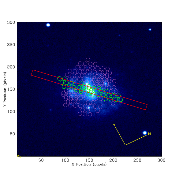
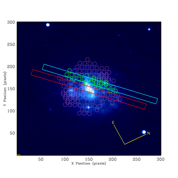
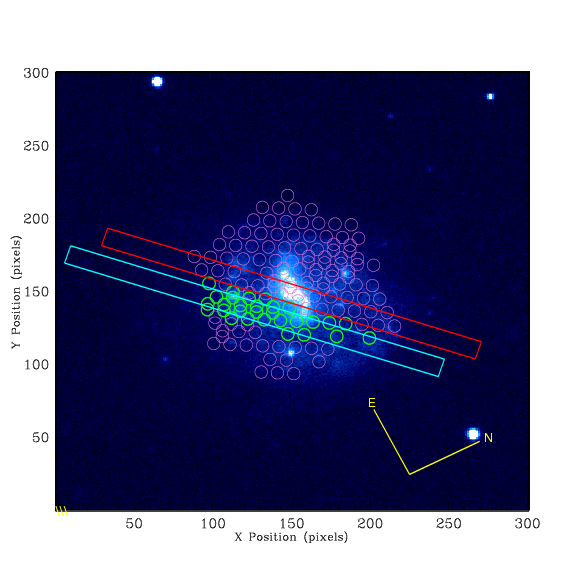
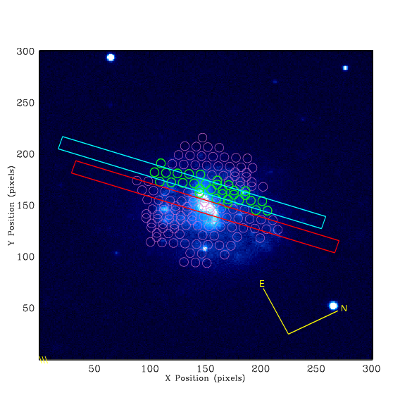
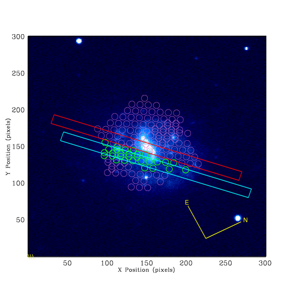
Black points represent fibers along a perfectly centrioded slit, blue shows the fibers in the offset slits. The width of the slits is shown, in arc seconds, in the heading of the graph. Each galaxy image shows the perfectly centroided slit in red and the offset slits in cyan. The fibers corresponding to each slit are shown highlighted.
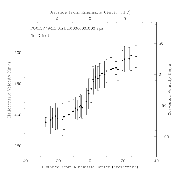
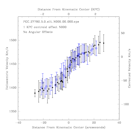
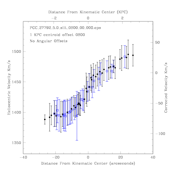
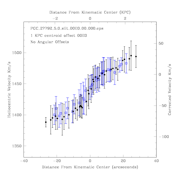

Note how the zero point of the corrected velocity does not seem to correspond to the center point of the curve. However, the error allowance of the individual data points make it possible for the center of an ideal velocity curve to simultaneously fall within the allowable errors and correspond to the zero point of the corrected velocity, or close to it. Even so, It seems strange that the stated average recessional velocity doesn't correspond with the apparent average velocity on the graphs. Further investigation is crucal to figuring out this discrepancy. I plan to contact Andersen et al to find out what method they used to determine the average recessional velocity of these galaxies. Trying to recover more accurate recessional velocities from the stated absolute magnitudes proved fruitless as there appears to be a large ammount of non Hubble flow.