Just as droplets of water in the atmosphere can separate out the colours of
the sunlight into a rainbow, or a prism can split up white light into a range
of colours, a spectrograph can disperse the light emitted from an
object according to wavelength.
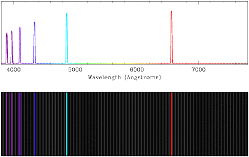
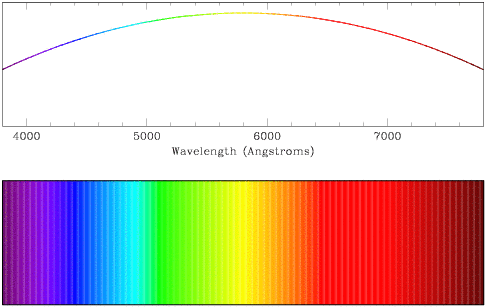
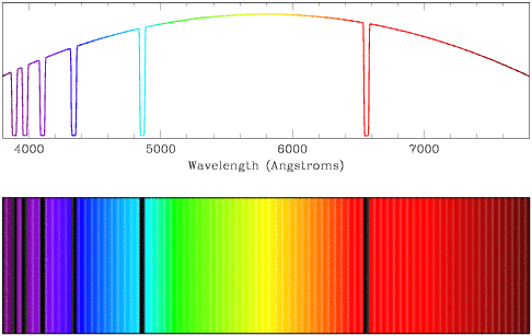
The figures below show examples of spectra of optical light. The x-axis
runs from short, blue wavelengths on the left to long, red wavelengths on the
right. The y-axis indicates the amount of light emitted at each wavelength -
the higher the level of the signal, the more light is present. In each case,
the top plot is a line plot showing intensity versus wavelength, while the
lower plot represents the spectrum as it would appear at the telescope.
Spectra can be divided into three broad categories.
- Continuum spectra show a relatively smooth shape, with no
strong features as a function of wavelength. In the case shown below, the
peak of the curve lies just below 6000 Angstroms (like the shape of the
spectrum of light emitted from the Sun).

- Absorption spectra are similar to continuum spectra, but light is
missing at certain wavelengths (in this case, indicating that hydrogen is
being absorbed). Observe how the absorption features (the low points) in the
top line plot are echoed as black bands in the lower plot.

- Emission spectra contain a very small amount of continuum flux (low
amounts of light distributed evenly at all wavelengths), with extra peaks of
light at certain wavelengths (in this case, indicating that hydrogen is being
emitted). In general, the emission features in an emission spectrum are
narrower than those in an absorption spectrum. Observe how the emission peaks
in the top line plot are echoed as bright lines in the lower plot.
