2008 Democratic Primaries - Pledged Delegate Map
Pledged Delegate Map
Map last updated 21 May 2008.
Sure, the news agencies all have Democratic Primary maps that color-code each state based on who won the popular vote. But in primary season, that doesn't tell the whole story: a landslide win nets you more delegates than a narrow win. Consider Minnesota and Missouri, two 72-delegate states in which Obama won the popular vote. Yet he won by a huge margin in Minnesota, gaining two thirds of the available delegates. In contrast, the delegate allocation in Missouri was split 36-36.
In the long run, each race boils down to the number of delegates won - particularly how many you get more than your opponent. In order to get a better view of which states were better to whom, I created a pledged delegate map:
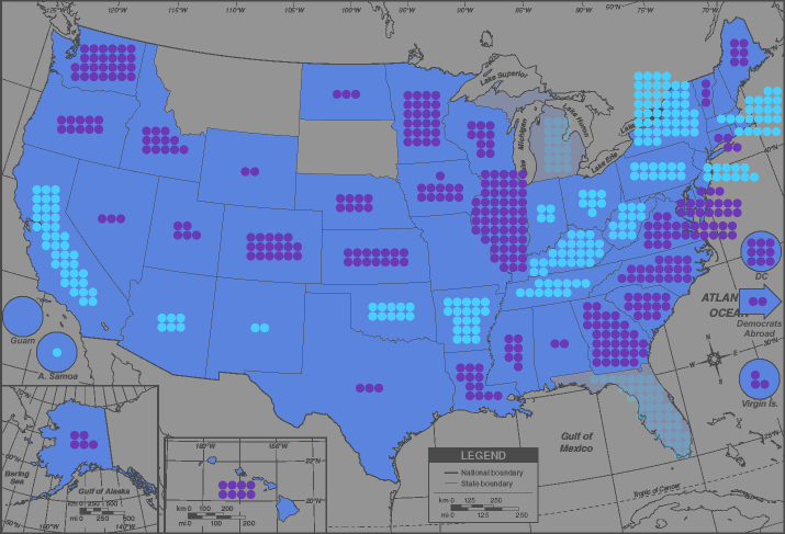
Click to enlarge.
As you might guess, each light blue dot represents an extra delegate for Clinton, and each dark blue (or purple) dot is an extra delegate for Obama. I've been getting most of my information from the DemConWatch blog's Ultimate Delegate Tracker.
Some miscellaneous notes:
- The map also shows (faintly) the delegates that would be sent to the Convention if the original elections in Florida and Michigan are accepted. Michigan's "ghost delegate" tally was determined assuming all of the "uncommitted" vote is given to Obama.
- On May 14, 2008, John Edwards endorsed Barack Obama. Edwards has previously won pledged delegates from primaries in Iowa, New Hampshire, and South Carolina (and Florida, if you want to count them).
All of these delegates have been freed to vote for whomever they want, just like superdelegates. Because of Edwards' endorsement, it is expected that most of these
delegates will support Obama. However, these delegates will not be factored into the net gains/losses of pledged delegates on this map (at least for now).
As of May 17, 2008, 2 out of Edwards' 4 Iowa delegates look like they will be for Obama, as well as 1/4 in New Hampshire and 7/8 in South Carolina. None of Edwards' other 6 (or 19 if you count Florida) have given indication of who they will endorse.
(source)
- Some delegate counts differ from source to source. At present, Obama's net gains in Colorado and Texas in particular may still vary by a couple delegates.
- Iowa was the first state to decide between the Democratic candidates, and the results allocated 16 delegates to Obama, 15 to Clinton, and 14 to Edwards. Iowa held county conventions on March 15, the next step in the process, and without Edwards in the race, the delegate count became 25 for Obama, 14 for Clinton, 6 for Edwards.
District conventions were held on April 26, and the delegate count became 24-14-7. (Exact delegate numbers still vary from news source to news source.)
- In Nevada, the precinct caucuses (January 19) and county conventions (February 23 and April 12) gave results where it looked like the ultimate outcome would be 13 delegates for Obama and 12 for Clinton. At the state convention on May 17, it became 14 for Obama, 11 for Clinton. (Ain't electoral arcana fun?)
- As far as the non-FL, non-MI delegates are concerned, the four largest net gains are in Illinois (55), New York (46), California (38), and Georgia (33). When combined, they almost cancel out, resulting in a net of 4 delegates for Obama.
