Doppler Shifts

If a wave is moving with respect to an observer (either toward or away from them), the observed frequency and wavelength of the wave will appear to change. We call this a Doppler shift. This effect can occur with both sound and light, because both sound and light demonstrate wave-like behavior.

What are some common examples of Doppler shifts?

Two-frame visualization of Doppler shift: On the left, a single black dot represents a stationary source of sound. A series of green circles represent sound waves emitted by the source and spreading outwards from the dot with time, much like ripples in a calm pool of water travel away from a pebble dropped into the middle. Two stick figures (observers) placed above and below the dot hear the same pitch (frequency) for the sounds. On the right, we see a series of black dots, the first at the same vertical height as the single dot on the left, and the rest appearing lower and lower to illustrate that the dot (the sound source) is moving downwards. A circle appears around each dot in turn and spreads outwards from the position of the dot at the time the circle appears. Instead of being green, the circles are red on the top and blue on the bottom. (This represents the downward motion of the dot, or source of sound, causing the sound waves to bunch up below and so seem to be higher frequency and to become more spaced out above and so seem to be lower frequency.)
[NMSU, N. Vogt]

Stationary Sound Source
The figure on the left shows a stationary sound source, like a smoke alarm blaring out sound waves. Compare it to the way that ripples spread outward on the surface of a very still pond, when you toss in a pebble. Sound waves are produced at a constant frequency, and the wavefronts (successive wave peaks) propagate symmetrically away from the source at a constant speed (the speed of sound in the medium). The distance between wavefronts is equal to the wavelength. All observers will hear the same frequency, which will be equal to the actual frequency of the source.

Moving Sound Source
The figure on the right shows the same sound source, still radiating sound waves at a constant frequency in the same medium. Now, however, the sound source is moving downward. The wavefronts are produced with the same frequency as before. Since the source is moving, the center of each new wavefront is now slightly displaced downward. As a result, the wavefronts begin to bunch up on the bottom side (in front of the source) and spread further apart on the top side (behind the source). An observer in front of the source (below) will hear a higher frequency, and an observer behind the source (above) will hear a lower frequency sound. The sound will not appear to have changed frequencies, to a hitchhiker traveling along with the sound source.

Imagine a similar example from daily life, such as listening to the sound of an an approaching train. The sound waves coming from the engine are squeezed closer together than they would be if the train were still. This happens because the train is moving in your direction. This shortening of the waves increases the number of waves (the frequency) that reach your ear every second. But after the noise of the train's engine passes, the frequency diminishes. The sound waves are now stretched apart by the train's movement in the opposite direction. As an observer, you perceive these frequency changes as shifts in the pitch of the sound. The pitch is higher as the train approaches, and lower as it travels away.

We characterize light by its frequency, or wavelength (the distance between successive beats, or until the pattern of the wave repeats itself, literally, the length of the wave). As shown below, blue light has a short wavelength, while red light has a longer wavelength.

Two-part figure shows two sine waves of different wavelengths. The top wave is blue (representing short wavelength light). A bar labeled Wavelength marks the short length between two successive peaks in the waveform. The bottom wave is red (representing long wavelength light). A much longer bar marks the much longer length between two successive peaks in this waveform. Note that the blue wave can fit more than seven complete sine waves across the width of the figure, while the red wave can fit only two across the same width.
[NMSU, N. Vogt]

When a star or galaxy is moving towards us, the wavelength of the light becomes shorter, and we say that it is blue-shifted. When it is moving away from us, the light is shifted towards longer wavelengths, and we say that it is red-shifted.

Three-part figure shows three train boxcars (long rectangles with two solid circles on the bottom representing wheels) being observed by three observers directly to the right of the boxcars. An arrow pointing rightward to the right of the top boxcar indicates that it is moving directly towards its observer, who sees the light from the boxcar being shifted to bluer, shorter wavelengths. (A blue short wavelength sine wave drawn inside the rectangle indicates how the light appears to the observer). The middle boxcar is stationary, and so a green intermediate wavelength sine wave drawn inside the rectangle indicates that the light appears to the observer to be the same wavelength at which it was emitted. An arrow pointing leftward to the left of the bottom boxcar indicates that it is moving directly away from its observer, who sees the light from the boxcar being shifted to redder, longer wavelengths. (A red long wavelength sine wave drawn inside the rectangle again indicates how the light appears to the observer.)
[NMSU, N. Vogt]

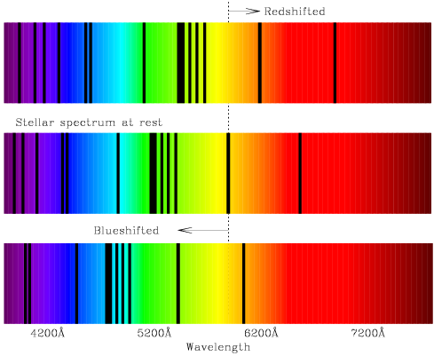
If the distance between a star and Earth is increasing, the spectral lines in the absorption or emission spectrum will shift slightly to the lower frequency, or red portion of the spectrum. If the distance is decreasing, the lines will shift toward the blue portion. The image below shows a simplified star spectrum with red and blue-shifts. Notice how the entire spectra gets shifted to the blue (left) or red (right).

Three-part figure shows three long rectangles filled with rainbow spectra colored violet, blue, green, yellow, orange, and red from the left side to the right side; The three spectra are arranged vertically on top of each other, so that the light of each color appears at the same position from left to right in all of the spectra. The middle spectrum is labeled 'Stellar spectra at rest' and a series of thin vertical black lines superimposed on top of the spectrum show the wavelengths at which absorption features appear in the spectrum (causing it to be dark). A vertical dashed line is drawn through one of these black lines (at a yellow wavelength), and the dashed line extends above and below the middle spectrum to run through the top and bottom spectra as well. The top spectrum is labeled 'Redshifted', and all of the thin black vertical lines indicating absorption features have been shifted to the right to redder colors (longer wavelengths). The bottom spectrum is labeled 'Blueshifted', and all of the thin black vertical lines have been shifted to the left to bluer colors (shorter wavelengths).
[NMSU, N. Vogt]